UX CASE STUDY
Simplifying Supplier
Award Decisions
Redesigning the award scenario experience at GEP to help procurement
teams set up rules and constraints with confidence, not confusion.
GEP WORLDWIDE
MY ROLE
UX Designer
TIMELINE
8 Weeks
TEAM
2 PM, 1 Designer, 1 Developers
TOOLS
Figma, Miro
THE CONTEXT
What is Award Scenario?
In strategic sourcing, once suppliers submit their bids through an RFx, procurement teams need to evaluate and award business to the right suppliers. Award Scenario is the tool within GEP Quantum that helps them do exactly this — by defining rules, setting constraints, and running optimisation scenarios to find the best supplier mix.
The Ask
The product team brought a requirement to enhance the entire award scenario creation journey. Users were struggling with the existing flow , the process felt overwhelming, the UI was data-heavy, and most users lacked the confidence to set up constraints on their own. We needed to simplify the experience end-to-end.
RESEARCH & DISCOVERY
Listening before designing
Before opening Figma, we spent time in the field, speaking with sourcing managers, observing their workflows, and understanding where they faced uncertainty.
12
users
Stakeholder & user interviews with sourcing managers across 3 regions
3
rounds
Usability testing sessions on the existing constraint builder flow
6
hours
Observational research watching users navigate live scenarios
“
"I know I need to set constraints but I never feel confident I'm doing it right. I always second-guess myself."
Sourcing Manager, FMCG
4 years in procurement
“
"I've done this process maybe 50 times and I still open the old documentation every single time because nothing in the tool tells me what to do."
Senior Buyer, Manufacturing
7 years in procurement
THE PROBLEM
Users felt lost and overwhelmed
Through stakeholder interviews and user feedback, we uncovered
four core pain points that made the experience frustrating.
01
Overwhelming Constraint Builder
The interface was dense and difficult to navigate. Setting up constraints often required domain knowledge that users were not always familiar with.
02
Confusing Terminology
Advanced technical terms with no guidance. Users were unsure what each constraint meant, what to consider, or how values would impact results.
03
Poor Visual Hierarchy
Icons without labels, actions without context, double-slider panels for supplier selection — the interface lacked clarity at every level.
04
No Guided Experience
No progressive guidance or templates. Even the outlier settings left users wondering what to configure and why it mattered.
DESIGN PRINCIPLES
Three principles that guided every decision
Before sketching a single frame, we defined these principles to keep the team aligned and decisions consistent.
01
Progressive Disclosure
Assist, don't overwhelm
Show users only what they need, when they need it. Complexity should be available — not mandatory. Every screen should feel like a natural next step, not an interrogation.
02
Contextual Guidance
Build confidence through context
Users don't fail because they're inexperienced — they fail because the system gives them no context. Every action should come with just enough explanation to make the user feel informed.
03
Inclusive Design
Design for the whole spectrum
First-timers and experts live in the same product. Our solution must serve both without making one feel like an afterthought. Flexibility is a feature, not a compromise.
THE OLD EXPERIENCE
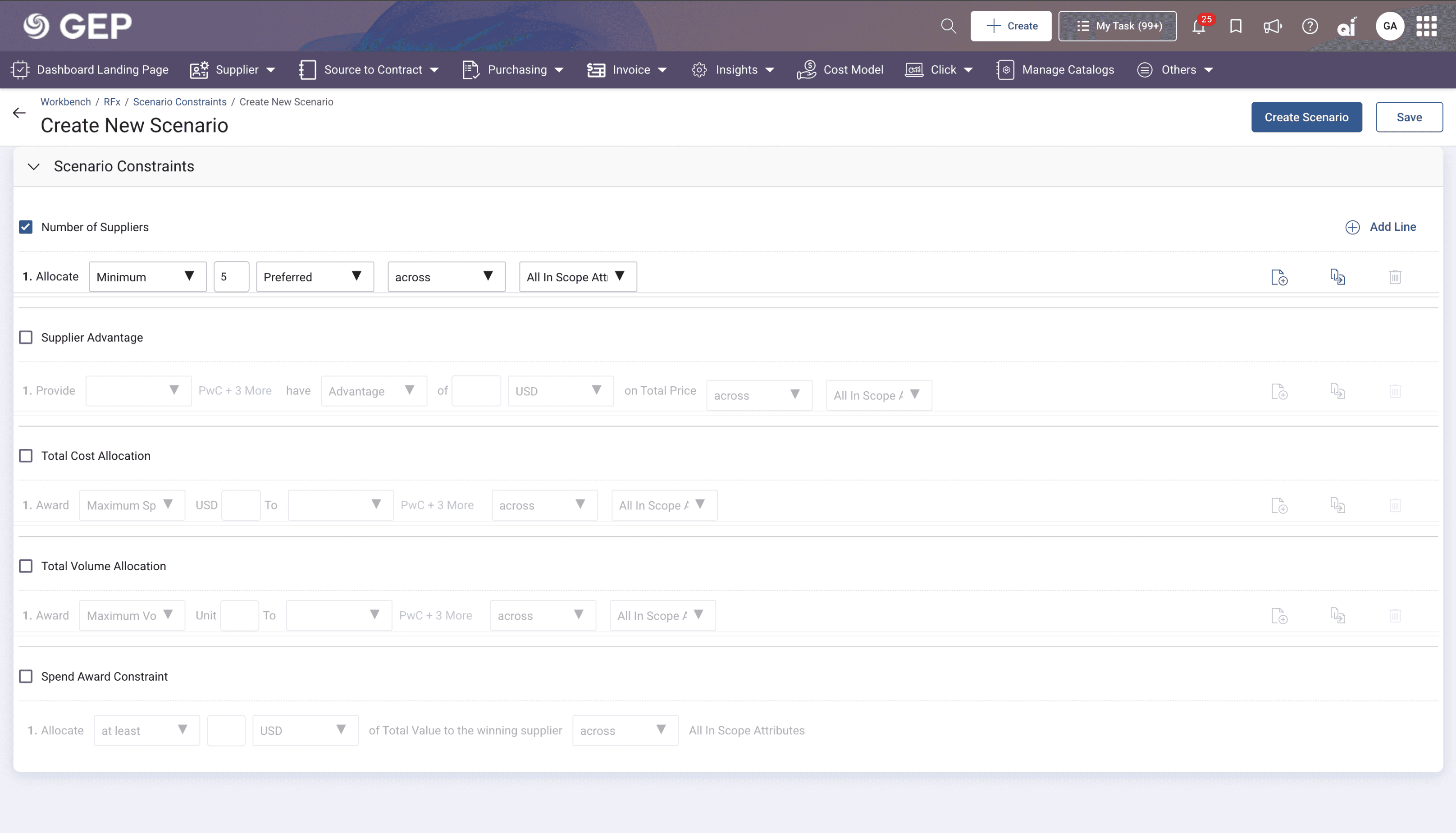
A cluttered, intimidating interface
The existing constraint builder was a dense, technical interface. Icons lacked labels,
the hierarchy was unclear, and there was no progressive guidance for the user.
✕
Icons without labels — users couldn't identify actions
✕
Double-slider panel for supplier selection
✕
No visual hierarchy or grouping of information

THE PROCESS
First Attempt — Visual Polish
Our first approach focused on enhancing the existing design - cleaner layouts, better placement of actions, contextual icons with labels, clear active/inactive states for constraints, and a constraint summary panel. While this improved visual clarity, user feedback told us the core problem still persisted. The fundamental complexity hadn't changed.
KEY INSIGHT
"Visual polish alone doesn't solve usability problems. We needed to rethink the information architecture — not just the interface."
The Pivot — Progressive Disclosure
We went back to the drawing board. After studying all the feedback and pain points, we arrived at a fundamentally different approach: progressive disclosure. Instead of presenting users with a complex builder upfront, the system would guide them through simplified, step-by-step decisions. Information would be revealed only when relevant — letting users focus on one choice at a time.
EXPLORATION & IDEATION
We explored 3 directions before converging
We ran a structured brainstorming sprint with the PM and engineering team. These were the three strongest directions — each with a real case for being the solution.
CONCEPT A
Ruled out
Smart Defaults & AI Suggestions
Let the system auto-populate constraints based on historical data and similar RFx events. Users would only need to review and approve.
Rejected: Procurement is high-stakes. Users needed to feel accountable — not rubber-stamping a black box they didn't configure.
CONCEPT B
Partially kept
Constraint Summary Cards
Keep the existing builder, but generate a plain-language summary after each constraint is set so users could review in simple terms.
Incorporated: Helpful as a companion but didn't solve the root issue — users still didn't know what to configure in the first place.
CONCEPT C
✓ Chosen
Progressive Disclosure + Rules
Replace the builder with guided step-by-step questions. Introduce Rules as reusable constraint groups. Keep the builder accessible for experts.
Chosen: Addressed the root cause, served both new and expert users, and was scalable as the product grew.
THE SOLUTION
An assisted, guided experience
Rules & Repository
Introduced the concept of reusable Rules — a group of constraints that users can save, reuse, and edit. No more building from scratch every time.
Progressive Disclosure
Step-by-step guided setup that reveals complexity gradually. Users answer simple questions instead of configuring a dense builder.
Assisted + Advanced Mode
Freedom to switch between a guided (assisted) experience and the full constraint builder for expert users who want granular control.
01
Rules as a first-class concept
We introduced Rules — a grouping of multiple constraints — as a new concept. Users can create rules from templates with prefilled constraints, save them to a repository, and reuse across scenarios. This eliminated the need to build constraints from scratch each time, giving users a head start and building their confidence.
02
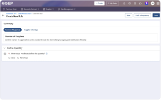
Guided constraint setup
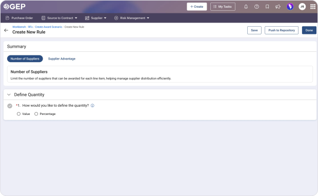
Instead of a dense builder, constraints are now set through simple, guided questions — one step at a time. Users choose how to define quantity (value or percentage), select a restriction type (minimum, maximum, between, or exact), and enter values. Each step builds on the last, with a clear summary generated at the end.
03
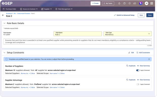
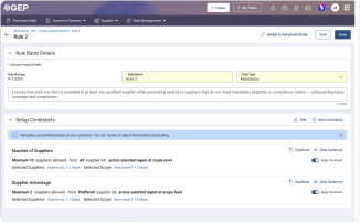
Your rule, at a glance
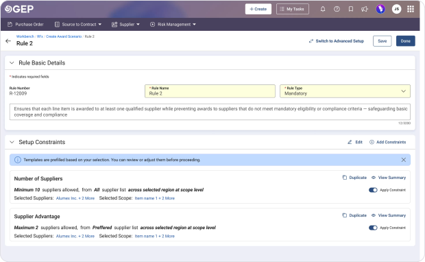
Once constraints are set, users arrive at the Rule screen — the control hub for the entire rule. Every constraint is shown as a plain-language summary: not raw settings, but a clear, readable description of what's been configured. This was designed to close the confidence gap — users who weren't sure if they'd done it right could now read exactly what they'd built.
From this one screen, they can enable or disable any constraint with a toggle, add new constraints, duplicate existing ones, or jump into a detailed view. The rule name, type, and an auto-generated description give full context at the top. No need to go deeper unless you want to.
WHAT USERS CAN DO HERE
Plain-language summary per constraint
Toggle constraints on/off without deleting
Add new constraints anytime
Duplicate or view detailed constraint summary
Edit rule name, type, and auto-generated description
04
Flexibility without compromise
We preserved the original constraint builder as an "Advanced" mode for expert users, while making the new guided experience the default "Assisted" mode. A simple toggle lets users switch anytime. This way, power users retain full control while regular users get the guidance they need.
The complete scenario creation flow
From rule selection to constraint setup to scenario creation — the entire journey redesigned.
THE TRANSFORMATION
From 11 confusing steps to 4 guided ones
The same outcome — awarding suppliers — but a fundamentally different experience of getting there.
BEFORE
Old Awarding Journey
11 steps
1
Navigate to Create Award Scenario
2
Configure price sheets & currencies
3
Open constraint builder
4
Decipher constraint types & names
5
Select suppliers via double slider panel
6
Set scope — unclear hierarchy
7
Configure Number of Suppliers constraint
8
Repeat for Supplier Advantage constraint
9
Set up Outliers — no guidance on values
10
Review unlabelled action icons
11
Hope you configured it correctly
→
AFTER
New Assisted Journey
4 steps
1
Select or create a Rule from repository
2
Answer: What type of constraint? (guided)
3
Answer: Set limits (min / max / exact)
4
Review auto-generated constraint summary
THE IMPACT
Measurable outcomes
40%
Reduction in setup time
Users completed scenario creation significantly faster with the guided flow
3.2×
Increase in first-time completion
New users were able to create scenarios without external help or documentation
85%
Preferred assisted mode
Majority of users chose the simplified guided experience over the advanced builder
REFLECTIONS
What I learned
1
Visual fixes ≠ usability fixes
Our first attempt proved that polishing an interface doesn't address fundamental information architecture problems. Understanding the root cause matters more than surface-level improvements.
2
Design for the spectrum, not the average
By creating both assisted and advanced modes, we served the entire user spectrum — from first-time users to domain experts — without forcing a one-size-fits-all solution.
3
Reusability builds confidence
The rules repository wasn't just a convenience feature — it fundamentally changed how users approached the task. Having a starting point removed the blank-canvas anxiety that was at the heart of the problem.
Thank you for reading
Aashna Khurana — UX Designer
UX CASE STUDY
Simplifying Supplier
Award Decisions
Redesigning award scenario creation at GEP to help teams set up constraints with confidence.
GEP WORLDWIDE
UX CASE STUDY
Simplifying Supplier
Award Decisions
Redesigning award scenario creation at GEP to help teams set up constraints with confidence.
GEP WORLDWIDE
MY ROLE
UX Designer
TIMELINE
8 Weeks
TEAM
1 PM, 2 Designers, 3 Devs
TOOLS
Figma, Miro, UserTesting
MY ROLE
UX Designer
TIMELINE
8 Weeks
TEAM
1 PM, 2 Designers, 3 Devs
TOOLS
Figma, Miro, UserTesting
MY ROLE
UX Designer
TIMELINE
8 Weeks
TEAM
1 PM, 2 Designers, 3 Devs
TOOLS
Figma, Miro, UserTesting
THE CONTEXT
What is Award Scenario?
In strategic sourcing, once suppliers submit bids through an RFx, procurement teams need to evaluate and award business to the right suppliers. Award Scenario is the GEP SMART tool that helps them define rules, set constraints, and run optimisation scenarios.
The Ask
The product team needed the entire award scenario creation journey enhanced. Users were struggling — the process felt overwhelming, the UI was data-heavy, and most users lacked the confidence to set up constraints on their own.
THE CONTEXT
What is Award Scenario?
In strategic sourcing, once suppliers submit bids through an RFx, procurement teams need to evaluate and award business to the right suppliers. Award Scenario is the GEP SMART tool that helps them define rules, set constraints, and run optimisation scenarios.
The Ask
The product team needed the entire award scenario creation journey enhanced. Users were struggling — the process felt overwhelming, the UI was data-heavy, and most users lacked the confidence to set up constraints on their own.
RESEARCH & DISCOVERY
Listening before designing
12
users
Stakeholder & user interviews with sourcing managers across 3 regions
3
rounds
Usability testing sessions on the existing constraint builder flow
6
hours
Observational research watching users navigate live scenarios
“
"I know I need to set constraints but I never feel confident I'm doing it right. I always second-guess myself."
Sourcing Manager, FMCG
4 years in procurement
“
"I've done this process maybe 50 times and I still open the old documentation every single time."
Senior Buyer, Manufacturing
7 years in procurement
THE PROBLEM
Users felt lost
and overwhelmed
01
Overwhelming Constraint Builder
The UI was data-heavy and intimidating. Only expert users could navigate it confidently.
02
Confusing Terminology
Advanced technical terms with no guidance on what to configure or why.
03
Poor Visual Hierarchy
Icons without labels, double-slider panels — clarity was absent at every level.
04
No Guided Experience
No progressive guidance or templates. Even outlier settings left users confused.
DESIGN PRINCIPLES
Three principles that
guided every decision
Progressive Disclosure
Assist, don't overwhelm
Show users only what they need, when they need it. Complexity should be available — not mandatory.
Contextual Guidance
Build confidence through context
Users don't fail because they're inexperienced — they fail because the system gives them no context.
Inclusive Design
Design for the whole spectrum
First-timers and experts live in the same product. Serve both without making one feel like an afterthought.
THE OLD EXPERIENCE
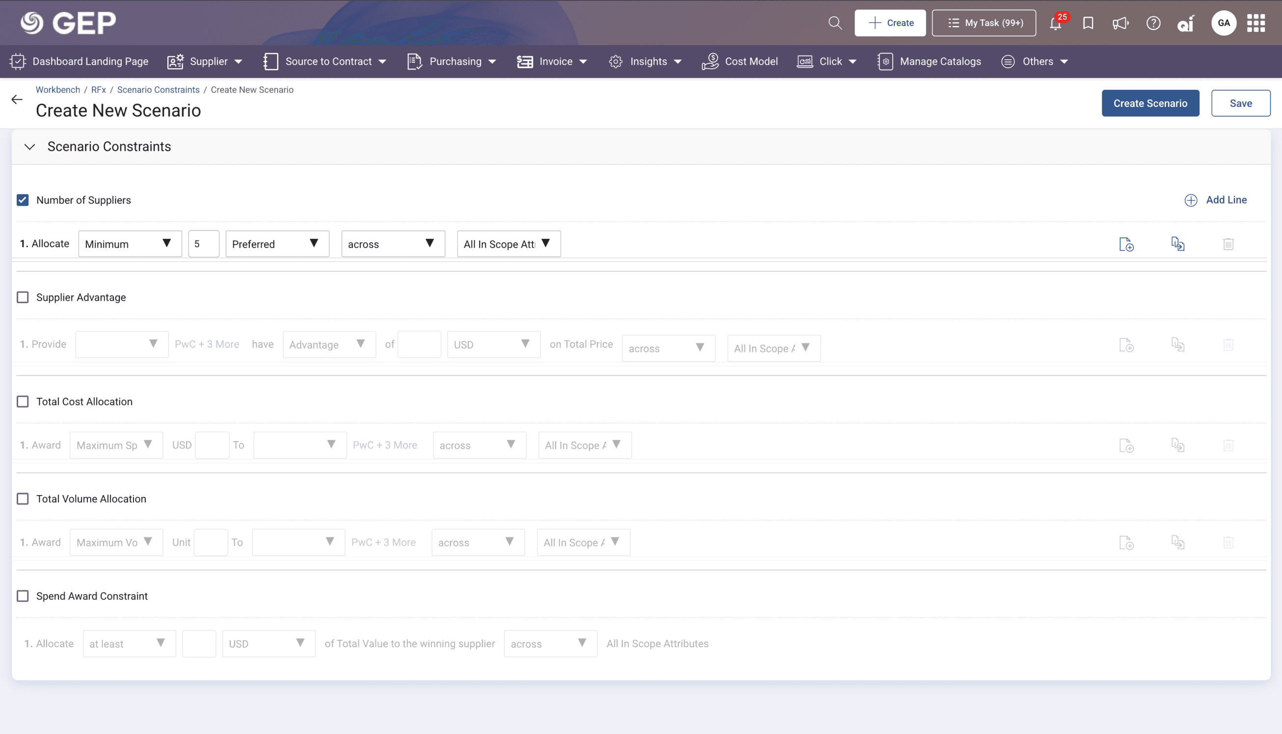
A cluttered, intimidating interface
The existing constraint builder was a dense, technical interface. Icons lacked labels,
the hierarchy was unclear, and there was no progressive guidance for the user.
✕
Icons without labels — users couldn't identify actions
✕
Double-slider panel for supplier selection



Create
My Tasks
JS
Workbench / RFx / Create Scenario
Create Scenario
Save
Setup Rules
✕
No visual hierarchy or grouping
THE PROCESS
First Attempt — Visual Polish
Our first approach focused on enhancing the existing design — cleaner layouts, contextual icons with labels, clear active/inactive states, and a constraint summary panel. While this improved visual clarity, user feedback told us the core problem still persisted.
The Pivot — Progressive Disclosure
We went back to the drawing board. After studying all the feedback and pain points, we arrived at a fundamentally different approach: progressive disclosure. Instead of presenting a complex builder upfront, the system would guide users through simplified, step-by-step decisions.
KEY INSIGHT
"Visual polish alone doesn't solve usability problems. We needed to rethink the information architecture — not just the interface."
EXPLORATION & IDEATION
We explored 3 directions before converging
CONCEPT A
Ruled out
Smart Defaults & AI Suggestions
Auto-populate constraints based on historical data. Users only review and approve.
Rejected: Procurement is high-stakes. Users needed to feel accountable — not rubber-stamping a black box they didn't configure.
CONCEPT B
Partially kept
Constraint Summary Cards
Keep the builder but generate plain-language summaries after each constraint.
Incorporated: Helpful as a companion but didn't solve the root issue — users still didn't know what to configure in the first place.
CONCEPT C
✓ Chosen
Progressive Disclosure + Rules
Guided step-by-step questions. Rules as reusable constraint groups. Expert mode kept.
Chosen: Addressed the root cause, served both new and expert users, and was scalable as the product grew.
THE SOLUTION
An assisted, guided experience
Rules & Repository
Reusable groups of constraints. Save, reuse, and edit — no more building from scratch every time.
Progressive Disclosure
Step-by-step guided setup revealing complexity only when needed.
Assisted + Advanced Mode
Freedom to switch between guided and full constraint builder for expert users.
01
Rules as a first-class concept
We introduced Rules — a grouping of multiple constraints — as a new concept. Users can create rules from templates with prefilled constraints, save them to a repository, and reuse across scenarios. This eliminated the need to build constraints from scratch each time, giving users a head start and building their confidence.
02
Guided constraint setup
Instead of a dense builder, constraints are now set through simple, guided questions — one step at a time. Users choose how to define quantity (value or percentage), select a restriction type (minimum, maximum, between, or exact), and enter values. Each step builds on the last, with a clear summary generated at the end.
03
Your rule, at a glance
Instead of a dense builder, constraints are now set through simple, guided questions — one step at a time. Users choose how to define quantity (value or percentage), select a restriction type (minimum, maximum, between, or exact), and enter values. Each step builds on the last, with a clear summary generated at the end.
WHAT USERS CAN DO HERE
Plain-language summary per constraint
Toggle constraints on/off without deleting
Add new constraints anytime
Duplicate or view detailed constraint summary
Edit rule name, type, and auto-generated description
04
Flexibility without compromise
We preserved the original constraint builder as an "Advanced" mode for expert users, while making the new guided experience the default "Assisted" mode. A simple toggle lets users switch anytime. This way, power users retain full control while regular users get the guidance they need.
The complete scenario creation flow
From rule selection to constraint setup to scenario creation — the entire journey redesigned.

THE TRANSFORMATION
From 11 confusing steps
to 4 guided ones
BEFORE · 11 steps
Old Awarding Journey
1
Navigate to Create Award Scenario
2
Configure price sheets & currencies
3
Open constraint builder
4
Decipher constraint types & names
5
Select suppliers via double slider panel
6
Set scope — unclear hierarchy
7
Configure Number of Suppliers constraint
8
Repeat for Supplier Advantage
9
Set up Outliers — no guidance
10
Review unlabelled action icons
11
Hope you configured it correctly
↓
AFTER · 4 steps
New Assisted Journey
1
Select or create a Rule from repository
2
Answer: What type of constraint? (guided)
3
Answer: Set limits (min / max / exact)
4
Review auto-generated constraint summary
THE IMPACT
Measurable outcomes
40%
Reduction in setup time
Users completed scenario creation significantly faster with the guided flow
3.2×
Increase in first-time completion
New users created scenarios without external help or documentation
85%
Preferred assisted mode
Majority chose the simplified guided experience over the advanced builder
REFLECTIONS
What I learned
1
Visual fixes ≠ usability fixes
Polishing an interface doesn't address fundamental information architecture problems. Understanding the root cause matters more.
2
Design for the spectrum, not the average
By creating both assisted and advanced modes, we served first-time users to domain experts — without forcing a one-size-fits-all solution.
3
Reusability builds confidence
The rules repository wasn't just a convenience feature — it removed the blank-canvas anxiety that was at the heart of the problem.
Thank you for reading
Aashna Khurana — UX Designer
MY ROLE
UX Designer
TIMELINE
8 Weeks
TEAM
1 PM, 2 Designers, 3 Devs
THE CONTEXT
What is Award Scenario?
In strategic sourcing, once suppliers submit bids through an RFx, procurement teams need to evaluate and award business to the right suppliers. Award Scenario is the GEP SMART tool that helps them define rules, set constraints, and run optimisation scenarios.
The Ask
The product team needed the entire award scenario creation journey enhanced. Users were struggling — the process felt overwhelming, the UI was data-heavy, and most users lacked the confidence to set up constraints on their own.
RESEARCH & DISCOVERY
Listening before designing
12
users
Stakeholder & user interviews with sourcing managers across 3 regions
3
rounds
Usability testing sessions on the existing constraint builder flow
6
hours
Observational research watching users navigate live scenarios
“
"I know I need to set constraints but I never feel confident I'm doing it right. I always second-guess myself."
Sourcing Manager, FMCG
4 years in procurement
“
"I've done this process maybe 50 times and I still open the old documentation every single time."
Senior Buyer, Manufacturing
7 years in procurement
THE PROBLEM
Users felt lost
and overwhelmed
01
Overwhelming Constraint Builder
The UI was data-heavy and intimidating. Only expert users could navigate it confidently.
02
Confusing Terminology
Advanced technical terms with no guidance on what to configure or why.
03
Poor Visual Hierarchy
Icons without labels, double-slider panels — clarity was absent at every level.
04
No Guided Experience
No progressive guidance or templates. Even outlier settings left users confused.
DESIGN PRINCIPLES
Three principles that
guided every decision
Progressive Disclosure
Assist, don't overwhelm
Show users only what they need, when they need it. Complexity should be available — not mandatory.
Contextual Guidance
Build confidence through context
Users don't fail because they're inexperienced — they fail because the system gives them no context.
Inclusive Design
Design for the whole spectrum
First-timers and experts live in the same product. Serve both without making one feel like an afterthought.
THE OLD EXPERIENCE
A cluttered, intimidating interface
The existing constraint builder was a dense, technical interface. Icons lacked labels,
the hierarchy was unclear, and there was no progressive guidance for the user.

✕
Icons without labels — users couldn't identify actions
✕
Double-slider panel for supplier selection
✕
No visual hierarchy or grouping
THE PROCESS
First Attempt — Visual Polish
Our first approach focused on enhancing the existing design — cleaner layouts, contextual icons with labels, clear active/inactive states, and a constraint summary panel. While this improved visual clarity, user feedback told us the core problem still persisted.
The Pivot — Progressive Disclosure
We went back to the drawing board. After studying all the feedback and pain points, we arrived at a fundamentally different approach: progressive disclosure. Instead of presenting a complex builder upfront, the system would guide users through simplified, step-by-step decisions.
KEY INSIGHT
"Visual polish alone doesn't solve usability problems. We needed to rethink the information architecture — not just the interface."
EXPLORATION & IDEATION
We explored 3 directions before converging
CONCEPT A
Ruled out
Smart Defaults & AI Suggestions
Auto-populate constraints based on historical data. Users only review and approve.
Rejected: Procurement is high-stakes. Users needed to feel accountable — not rubber-stamping a black box they didn't configure.
CONCEPT B
Partially kept
Constraint Summary Cards
Keep the builder but generate plain-language summaries after each constraint.
Incorporated: Helpful as a companion but didn't solve the root issue — users still didn't know what to configure in the first place.
CONCEPT C
✓ Chosen
Progressive Disclosure + Rules
Guided step-by-step questions. Rules as reusable constraint groups. Expert mode kept.
Chosen: Addressed the root cause, served both new and expert users, and was scalable as the product grew.
THE SOLUTION
An assisted, guided experience
Rules & Repository
Reusable groups of constraints. Save, reuse, and edit — no more building from scratch every time.
Progressive Disclosure
Step-by-step guided setup revealing complexity only when needed.
Assisted + Advanced Mode
Freedom to switch between guided and full constraint builder for expert users.
01
Rules as a first-class concept
We introduced Rules — a grouping of multiple constraints — as a new concept. Users can create rules from templates with prefilled constraints, save them to a repository, and reuse across scenarios. This eliminated the need to build constraints from scratch each time, giving users a head start and building their confidence.

02
Guided constraint setup
Instead of a dense builder, constraints are now set through simple, guided questions — one step at a time. Users choose how to define quantity (value or percentage), select a restriction type (minimum, maximum, between, or exact), and enter values. Each step builds on the last, with a clear summary generated at the end.
03
Your rule, at a glance
Instead of a dense builder, constraints are now set through simple, guided questions — one step at a time. Users choose how to define quantity (value or percentage), select a restriction type (minimum, maximum, between, or exact), and enter values. Each step builds on the last, with a clear summary generated at the end.
WHAT USERS CAN DO HERE
Plain-language summary per constraint
Toggle constraints on/off without deleting
Add new constraints anytime
Duplicate or view detailed constraint summary
Edit rule name, type, and auto-generated description
04
Flexibility without compromise
We preserved the original constraint builder as an "Advanced" mode for expert users, while making the new guided experience the default "Assisted" mode. A simple toggle lets users switch anytime. This way, power users retain full control while regular users get the guidance they need.

The complete scenario creation flow
From rule selection to constraint setup to scenario creation — the entire journey redesigned.

THE TRANSFORMATION
From 11 confusing steps
to 4 guided ones
BEFORE · 11 steps
Old Awarding Journey
1
Navigate to Create Award Scenario
2
Configure price sheets & currencies
3
Open constraint builder
4
Decipher constraint types & names
5
Select suppliers via double slider panel
6
Set scope — unclear hierarchy
7
Configure Number of Suppliers constraint
8
Repeat for Supplier Advantage
9
Set up Outliers — no guidance
10
Review unlabelled action icons
11
Hope you configured it correctly
↓
AFTER · 4 steps
New Assisted Journey
1
Select or create a Rule from repository
2
Answer: What type of constraint? (guided)
3
Answer: Set limits (min / max / exact)
4
Review auto-generated constraint summary
THE IMPACT
Measurable outcomes
40%
Reduction in setup time
Users completed scenario creation significantly faster with the guided flow
3.2×
Increase in first-time completion
New users created scenarios without external help or documentation
85%
Preferred assisted mode
Majority chose the simplified guided experience over the advanced builder
REFLECTIONS
What I learned
1
Visual fixes ≠ usability fixes
Polishing an interface doesn't address fundamental information architecture problems. Understanding the root cause matters more.
2
Design for the spectrum, not the average
By creating both assisted and advanced modes, we served first-time users to domain experts — without forcing a one-size-fits-all solution.
3
Reusability builds confidence
The rules repository wasn't just a convenience feature — it removed the blank-canvas anxiety that was at the heart of the problem.
Thank you for reading
Aashna Khurana — UX Designer
UX CASE STUDY
Simplifying Supplier
Award Decisions
Redesigning award scenario creation at GEP to help teams set up constraints with confidence.
GEP WORLDWIDE
UX CASE STUDY
Simplifying Supplier
Award Decisions
Redesigning award scenario creation at GEP to help teams set up constraints with confidence.
GEP WORLDWIDE
MY ROLE
UX Designer
TIMELINE
8 Weeks
TEAM
1 PM, 2 Designers, 3 Devs
TOOLS
Figma, Miro, UserTesting
MY ROLE
UX Designer
TIMELINE
8 Weeks
TEAM
1 PM, 2 Designers, 3 Devs
TOOLS
Figma, Miro, UserTesting
MY ROLE
UX Designer
TIMELINE
8 Weeks
TEAM
1 PM, 2 Designers, 3 Devs
TOOLS
Figma, Miro, UserTesting
THE CONTEXT
What is Award Scenario?
In strategic sourcing, once suppliers submit bids through an RFx, procurement teams need to evaluate and award business to the right suppliers. Award Scenario is the GEP SMART tool that helps them define rules, set constraints, and run optimisation scenarios.
The Ask
The product team needed the entire award scenario creation journey enhanced. Users were struggling — the process felt overwhelming, the UI was data-heavy, and most users lacked the confidence to set up constraints on their own.
THE CONTEXT
What is Award Scenario?
In strategic sourcing, once suppliers submit bids through an RFx, procurement teams need to evaluate and award business to the right suppliers. Award Scenario is the GEP SMART tool that helps them define rules, set constraints, and run optimisation scenarios.
The Ask
The product team needed the entire award scenario creation journey enhanced. Users were struggling — the process felt overwhelming, the UI was data-heavy, and most users lacked the confidence to set up constraints on their own.
RESEARCH & DISCOVERY
Listening before designing
12
users
Stakeholder & user interviews with sourcing managers across 3 regions
3
rounds
Usability testing sessions on the existing constraint builder flow
6
hours
Observational research watching users navigate live scenarios
“
"I know I need to set constraints but I never feel confident I'm doing it right. I always second-guess myself."
Sourcing Manager, FMCG
4 years in procurement
“
"I've done this process maybe 50 times and I still open the old documentation every single time."
Senior Buyer, Manufacturing
7 years in procurement
THE PROBLEM
Users felt lost
and overwhelmed
01
Overwhelming Constraint Builder
The UI was data-heavy and intimidating. Only expert users could navigate it confidently.
02
Confusing Terminology
Advanced technical terms with no guidance on what to configure or why.
03
Poor Visual Hierarchy
Icons without labels, double-slider panels — clarity was absent at every level.
04
No Guided Experience
No progressive guidance or templates. Even outlier settings left users confused.
DESIGN PRINCIPLES
Three principles that
guided every decision
Progressive Disclosure
Assist, don't overwhelm
Show users only what they need, when they need it. Complexity should be available — not mandatory.
Contextual Guidance
Build confidence through context
Users don't fail because they're inexperienced — they fail because the system gives them no context.
Inclusive Design
Design for the whole spectrum
First-timers and experts live in the same product. Serve both without making one feel like an afterthought.
THE OLD EXPERIENCE
A cluttered, intimidating interface
The existing constraint builder was a dense, technical interface. Icons lacked labels,
the hierarchy was unclear, and there was no progressive guidance for the user.
✕
Icons without labels — users couldn't identify actions
✕
Double-slider panel for supplier selection
Create
My Tasks
JS
Workbench / RFx / Create Scenario
Create Scenario
Save
Setup Rules
✕
No visual hierarchy or grouping
THE PROCESS
First Attempt — Visual Polish
Our first approach focused on enhancing the existing design — cleaner layouts, contextual icons with labels, clear active/inactive states, and a constraint summary panel. While this improved visual clarity, user feedback told us the core problem still persisted.
The Pivot — Progressive Disclosure
We went back to the drawing board. After studying all the feedback and pain points, we arrived at a fundamentally different approach: progressive disclosure. Instead of presenting a complex builder upfront, the system would guide users through simplified, step-by-step decisions.
KEY INSIGHT
"Visual polish alone doesn't solve usability problems. We needed to rethink the information architecture — not just the interface."
EXPLORATION & IDEATION
We explored 3 directions before converging
CONCEPT A
Ruled out
Smart Defaults & AI Suggestions
Auto-populate constraints based on historical data. Users only review and approve.
Rejected: Procurement is high-stakes. Users needed to feel accountable — not rubber-stamping a black box they didn't configure.
CONCEPT B
Partially kept
Constraint Summary Cards
Keep the builder but generate plain-language summaries after each constraint.
Incorporated: Helpful as a companion but didn't solve the root issue — users still didn't know what to configure in the first place.
CONCEPT C
✓ Chosen
Progressive Disclosure + Rules
Guided step-by-step questions. Rules as reusable constraint groups. Expert mode kept.
Chosen: Addressed the root cause, served both new and expert users, and was scalable as the product grew.
THE SOLUTION
An assisted, guided experience
Rules & Repository
Reusable groups of constraints. Save, reuse, and edit — no more building from scratch every time.
Progressive Disclosure
Step-by-step guided setup revealing complexity only when needed.
Assisted + Advanced Mode
Freedom to switch between guided and full constraint builder for expert users.
01
Rules as a first-class concept
We introduced Rules — a grouping of multiple constraints — as a new concept. Users can create rules from templates with prefilled constraints, save them to a repository, and reuse across scenarios. This eliminated the need to build constraints from scratch each time, giving users a head start and building their confidence.
02
Guided constraint setup
Instead of a dense builder, constraints are now set through simple, guided questions — one step at a time. Users choose how to define quantity (value or percentage), select a restriction type (minimum, maximum, between, or exact), and enter values. Each step builds on the last, with a clear summary generated at the end.
03
Your rule, at a glance
Instead of a dense builder, constraints are now set through simple, guided questions — one step at a time. Users choose how to define quantity (value or percentage), select a restriction type (minimum, maximum, between, or exact), and enter values. Each step builds on the last, with a clear summary generated at the end.
WHAT USERS CAN DO HERE
Plain-language summary per constraint
Toggle constraints on/off without deleting
Add new constraints anytime
Duplicate or view detailed constraint summary
Edit rule name, type, and auto-generated description
04
Flexibility without compromise
We preserved the original constraint builder as an "Advanced" mode for expert users, while making the new guided experience the default "Assisted" mode. A simple toggle lets users switch anytime. This way, power users retain full control while regular users get the guidance they need.
The complete scenario creation flow
From rule selection to constraint setup to scenario creation — the entire journey redesigned.
THE TRANSFORMATION
From 11 confusing steps
to 4 guided ones
BEFORE · 11 steps
Old Awarding Journey
1
Navigate to Create Award Scenario
2
Configure price sheets & currencies
3
Open constraint builder
4
Decipher constraint types & names
5
Select suppliers via double slider panel
6
Set scope — unclear hierarchy
7
Configure Number of Suppliers constraint
8
Repeat for Supplier Advantage
9
Set up Outliers — no guidance
10
Review unlabelled action icons
11
Hope you configured it correctly
↓
AFTER · 4 steps
New Assisted Journey
1
Select or create a Rule from repository
2
Answer: What type of constraint? (guided)
3
Answer: Set limits (min / max / exact)
4
Review auto-generated constraint summary
THE IMPACT
Measurable outcomes
40%
Reduction in setup time
Users completed scenario creation significantly faster with the guided flow
3.2×
Increase in first-time completion
New users created scenarios without external help or documentation
85%
Preferred assisted mode
Majority chose the simplified guided experience over the advanced builder
REFLECTIONS
What I learned
1
Visual fixes ≠ usability fixes
Polishing an interface doesn't address fundamental information architecture problems. Understanding the root cause matters more.
2
Design for the spectrum, not the average
By creating both assisted and advanced modes, we served first-time users to domain experts — without forcing a one-size-fits-all solution.
3
Reusability builds confidence
The rules repository wasn't just a convenience feature — it removed the blank-canvas anxiety that was at the heart of the problem.
Thank you for reading
Aashna Khurana — UX Designer
MY ROLE
UX Designer
TIMELINE
8 Weeks
TEAM
1 PM, 2 Designers, 3 Devs
THE CONTEXT
What is Award Scenario?
In strategic sourcing, once suppliers submit bids through an RFx, procurement teams need to evaluate and award business to the right suppliers. Award Scenario is the GEP SMART tool that helps them define rules, set constraints, and run optimisation scenarios.
The Ask
The product team needed the entire award scenario creation journey enhanced. Users were struggling — the process felt overwhelming, the UI was data-heavy, and most users lacked the confidence to set up constraints on their own.
RESEARCH & DISCOVERY
Listening before designing
12
users
Stakeholder & user interviews with sourcing managers across 3 regions
3
rounds
Usability testing sessions on the existing constraint builder flow
6
hours
Observational research watching users navigate live scenarios
“
"I know I need to set constraints but I never feel confident I'm doing it right. I always second-guess myself."
Sourcing Manager, FMCG
4 years in procurement
“
"I've done this process maybe 50 times and I still open the old documentation every single time."
Senior Buyer, Manufacturing
7 years in procurement
THE PROBLEM
Users felt lost
and overwhelmed
01
Overwhelming Constraint Builder
The UI was data-heavy and intimidating. Only expert users could navigate it confidently.
02
Confusing Terminology
Advanced technical terms with no guidance on what to configure or why.
03
Poor Visual Hierarchy
Icons without labels, double-slider panels — clarity was absent at every level.
04
No Guided Experience
No progressive guidance or templates. Even outlier settings left users confused.
DESIGN PRINCIPLES
Three principles that
guided every decision
Progressive Disclosure
Assist, don't overwhelm
Show users only what they need, when they need it. Complexity should be available — not mandatory.
Contextual Guidance
Build confidence through context
Users don't fail because they're inexperienced — they fail because the system gives them no context.
Inclusive Design
Design for the whole spectrum
First-timers and experts live in the same product. Serve both without making one feel like an afterthought.
THE OLD EXPERIENCE
A cluttered, intimidating interface
The existing constraint builder was a dense, technical interface. Icons lacked labels,
the hierarchy was unclear, and there was no progressive guidance for the user.
✕
Icons without labels — users couldn't identify actions
✕
Double-slider panel for supplier selection
✕
No visual hierarchy or grouping
THE PROCESS
First Attempt — Visual Polish
Our first approach focused on enhancing the existing design — cleaner layouts, contextual icons with labels, clear active/inactive states, and a constraint summary panel. While this improved visual clarity, user feedback told us the core problem still persisted.
The Pivot — Progressive Disclosure
We went back to the drawing board. After studying all the feedback and pain points, we arrived at a fundamentally different approach: progressive disclosure. Instead of presenting a complex builder upfront, the system would guide users through simplified, step-by-step decisions.
KEY INSIGHT
"Visual polish alone doesn't solve usability problems. We needed to rethink the information architecture — not just the interface."
EXPLORATION & IDEATION
We explored 3 directions before converging
CONCEPT A
Ruled out
Smart Defaults & AI Suggestions
Auto-populate constraints based on historical data. Users only review and approve.
Rejected: Procurement is high-stakes. Users needed to feel accountable — not rubber-stamping a black box they didn't configure.
CONCEPT B
Partially kept
Constraint Summary Cards
Keep the builder but generate plain-language summaries after each constraint.
Incorporated: Helpful as a companion but didn't solve the root issue — users still didn't know what to configure in the first place.
CONCEPT C
✓ Chosen
Progressive Disclosure + Rules
Guided step-by-step questions. Rules as reusable constraint groups. Expert mode kept.
Chosen: Addressed the root cause, served both new and expert users, and was scalable as the product grew.
THE SOLUTION
An assisted, guided experience
Rules & Repository
Reusable groups of constraints. Save, reuse, and edit — no more building from scratch every time.
Progressive Disclosure
Step-by-step guided setup revealing complexity only when needed.
Assisted + Advanced Mode
Freedom to switch between guided and full constraint builder for expert users.
01
Rules as a first-class concept
We introduced Rules — a grouping of multiple constraints — as a new concept. Users can create rules from templates with prefilled constraints, save them to a repository, and reuse across scenarios. This eliminated the need to build constraints from scratch each time, giving users a head start and building their confidence.
02
Guided constraint setup
Instead of a dense builder, constraints are now set through simple, guided questions — one step at a time. Users choose how to define quantity (value or percentage), select a restriction type (minimum, maximum, between, or exact), and enter values. Each step builds on the last, with a clear summary generated at the end.
03
Your rule, at a glance
Instead of a dense builder, constraints are now set through simple, guided questions — one step at a time. Users choose how to define quantity (value or percentage), select a restriction type (minimum, maximum, between, or exact), and enter values. Each step builds on the last, with a clear summary generated at the end.
WHAT USERS CAN DO HERE
Plain-language summary per constraint
Toggle constraints on/off without deleting
Add new constraints anytime
Duplicate or view detailed constraint summary
Edit rule name, type, and auto-generated description
04
Flexibility without compromise
We preserved the original constraint builder as an "Advanced" mode for expert users, while making the new guided experience the default "Assisted" mode. A simple toggle lets users switch anytime. This way, power users retain full control while regular users get the guidance they need.
The complete scenario creation flow
From rule selection to constraint setup to scenario creation — the entire journey redesigned.
THE TRANSFORMATION
From 11 confusing steps
to 4 guided ones
BEFORE · 11 steps
Old Awarding Journey
1
Navigate to Create Award Scenario
2
Configure price sheets & currencies
3
Open constraint builder
4
Decipher constraint types & names
5
Select suppliers via double slider panel
6
Set scope — unclear hierarchy
7
Configure Number of Suppliers constraint
8
Repeat for Supplier Advantage
9
Set up Outliers — no guidance
10
Review unlabelled action icons
11
Hope you configured it correctly
↓
AFTER · 4 steps
New Assisted Journey
1
Select or create a Rule from repository
2
Answer: What type of constraint? (guided)
3
Answer: Set limits (min / max / exact)
4
Review auto-generated constraint summary
THE IMPACT
Measurable outcomes
40%
Reduction in setup time
Users completed scenario creation significantly faster with the guided flow
3.2×
Increase in first-time completion
New users created scenarios without external help or documentation
85%
Preferred assisted mode
Majority chose the simplified guided experience over the advanced builder
REFLECTIONS
What I learned
1
Visual fixes ≠ usability fixes
Polishing an interface doesn't address fundamental information architecture problems. Understanding the root cause matters more.
2
Design for the spectrum, not the average
By creating both assisted and advanced modes, we served first-time users to domain experts — without forcing a one-size-fits-all solution.
3
Reusability builds confidence
The rules repository wasn't just a convenience feature — it removed the blank-canvas anxiety that was at the heart of the problem.
Thank you for reading
Aashna Khurana — UX Designer